At the time of writing this article, there are 3 major ways to go about developing mobile optimized (and tablet optimized) websites. But first let me briefly explain what a mobile optimized website is. Since mobile monitors come in a variety of sizes, and since they have different screen dimensions compared to desktopor laptop monitors, as well as different aspect ratios, it makes sense to present a website differently on desktop computers, laptops and mobile devices. This is one of the main reasons why many website developers are developing sites with mobile optimization in minds.
Following are the three main methods that one can take when developing websites with mobile optimization in mind. Plenty of details and information are available online but this should help you decide on the best method for your website.
Responsive Website Design
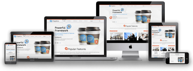
In my opinion, and in the opinion of many experts, responsive website design is the best method for mobile optimization available and the most popular one. It is also the method that is the most recommended by Google and other search engines. A responsive website uses html and css or even better html5 and css3 to adjust it’s display depending on the device that is being used to view it. This means that the site can display differently on mobile devices, tablets, laptops and desktops. With this method it is possible to rescale images, videos and text to ideally fit the screen of the device that is viewing it, eliminating the need for horizontal scrolling, or zooming in/out on mobile devices. No matter how wide or narrow the width of the device that is browsing the site is, the website will rescale to fit it perfectly. Not only can we rescale content but we can also totally change the look and feel of the website to give the user the optimal experience depending on the device they are using to view the site. For example we can change the way the main navigation looks and functions.
In the images below you can see some of the differences in website layout for desktop and mobile versions of my website. You can check out the website to learn more about responsive website design and see the responsive design in action by clicking Mobile Website Design Mississauga. The first image below shows how the website menu and slider look on a desktop monitor, and the two other images show how the menu and slider look on a mobile device.
Here we are using different style sheets which dictate how content is displayed based on the device that is viewing it. Mobile devices are being fed the mobile style sheet while desktop devices are fed the standard (desktop) style sheet.
Responsive Website Design Example
Watch this quick video I did below, which compares responsive website design to conventional/traditional non-responsive website design.
Advantages of Responsive website design
Watch the video below where I showcase the 4 major advantages of responsive website design: dynamic navigations, javascript sliders, laying out content, and optimal user experience.
In the above video you can see how we can change the way content is displayed and organized on mobile devices in navigations, javascript sliders and on page, making it easy for mobile users to interact with your website.
 For mobile and tablet devices, we can add finger controls that enable users to use finger swiping to switch between slides rather than trying to click small slider control buttons that are usually intended to be clicked on with the mouse and not with fingers.
 Another big reason why responsive website design is the ideal approach for mobile website development is because search engines love it.
From a search engine perspective responsive websites contain the same content, no matter what device is viewing them, the only thing that changes is how content is displayed and functions. This has a positive impact on search engine rankings compared to the other popular mobile optimization methods explained below.
 Also, responsive websites can load faster on mobile devices and tablets compared to traditional, non responsive websites since content such as images can be downsized. This makes it beneficial not only to users but also to search engines like Google, as search engines rank websites that load faster more favourably compared to slower loading sites when displaying search results on mobile devices.
 You can always check your websites mobile and desktop speed on Google Page Speed Insights.
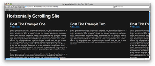
Another reason why responsive website design is beneficial is that even on desktop computers, users often shrink the width of their browser so it is not maximized on their monitor. For example, in cases when they are working with Microsoft Word and need to see their internet browser at the same time. This adds a nasty horizontal scroll bar to traditional websites but not to properly developed responsive websites. See an example of a bad website below with a nasty horizontal scroll bar.

Responsive websites will simply adjust all the website content to fit the width of the browser window. So it doesn’t matter if the browser window is shrunk to 400px, 800px or 1080px width, the responsive website will display perfectly no matter what the browser width is. Too see an example of this go to www.wisevu.com or www.loveyourrug.ca and adjust the width of your browser window. You will notice the site adjusting to fit your browser size. This is the power of responsive website design.

These are some of the main reasons why responsive website design is beneficial to modern day websites. However, the capabilities are endless and creativity leads to limitless designs and functions of responsive websites.
Subdirectory Mobile Website Development

Subdirectory mobile website development involves creating a completely separate website for mobile users and placing it on your server in a different folder than your main (desktop) website. The main advantage of subdirectory mobile website development, as well as subdomain mobile website development, is that you have total control of how to make your website look without any restrictions of sharing stylesheets or website files between the desktop website and mobile website. This approach gives complete design/development freedom for the creation of the mobile website version compared to the responsive website design approach, and may be ideal for websites that contain loads of content and heavy, resource intensive applications that would simply be too much to display to mobile users. Most websites that use this mobile development approach want to create a simplified version of their website that will help mobile users to use their website, which would otherwise be too difficult or impossible for them to use, even if the responsive website design method is used.
Now that you know the main advantage of subdirectory mobile website development lets talk more about how to implement this approach. With this approach, if your main desktop website files are located in the root folder on your server, for example, www.mywebsite.com/ and if you are creating a subdirectory mobile website, you could create a folder called “mobile” in the root directory of your main (desktop) website and put all your mobile website files in that folder. In this case your mobile website would be located at www.yourwebsite.com/mobile/.
You would then use certain coding on your main desktop website pages to detect a mobile device. Various scripts are available which allow you to detect mobile devices. You can detect mobile devices based on the mobile device make and model (eg. iPhone 5, iPhone 6, Nexus 6, etc…). However, this method would require you to update your script for new versions of mobile phones, so they are included as recognizable mobile devices, and this always sucks! You can get the updated light-weight php scrips for mobile detection here – Mobile detection php scripts.
Alternatively you can detect mobile devices by instructing your website to display the mobile version of your website based on users’ browser width. The majority of mobile devices today have browser widths smaller than 580px. Your mobile detection code would be placed in your website’s header section and would look like this.
This code simply checks if the browser width of the device that is used to visit your website is smaller than 580 pixels, if it is it will show your mobile website (www.yourwebsite.com/mobile/) if the browser width is larger than 580 pixels than it will show your desktop website (www.mywebsite.com). Simple right!
With this approach you will need this script on each page of your desktop website, redirecting mobile users to the appropriate mobile pages. So for example if you have an about-us page, which you called www.yourwebiste.com/about.html, then the mobile detection code would change to:
Finally the last step is to include some code into your mobile website pages to tell Google and other search engines that your mobile pages are actually duplicates of your desktop pages. This way you will not get penalized for duplicate content, and your rankings wont get hurt.
To do this, in your mobile page headers you will add the following code.
This code tells search engines that the mobile page, in this case www.yourwebiste.com/mobile/about.html, is a duplicate of the desktop page www.yourwebiste.com/about.html. You can search more about canonical links on Google.
 Please note, that if your mobile page is drastically different than your desktop page, this canonical link should not be used because in this case, your mobile page is not a good duplicate representation of your desktop page. This would require you to treat your mobile page as a completely separate page than your desktop page when it comes to search engine optimization. What this means is that your desktop page would rank in search engine results for desktop users searching for your website, but it wouldn’t rank well for mobile users using search engines to search for your website. This would require you to do separate SEO work to optimize your mobile page to rank. This is a major drawback, and one of the main reasons why I avoid this mobile development method! However some companies choose user experience over search engine results and they do double SEO work to get their mobile pages ranking as well.
Finally, you will need to design and develop your mobile website version and make it mobile friendly so it looks good on mobile devices, but this is beyond the scope of this article.
Examples
You can look at the source code on www.richmondhillautoglass.ca/ and www.richmondhillautoglass.ca/m/ to see some of the techniques that were used to create this subdirectory mobile website. Other websites that use this mobile development method are www.newmarketautoglass.ca and http://www.midnightsuntanning.ca/ and http://www.midnightsuntanning.ca/m/ which offers spray tanning in Mississauga.
In the source code of these subdirectory developed mobile websites look out for header code like:
These are specific instructions instructing browsers on mobile phones how to handle the mobile website. you can read more about them online.
Subdomain Mobile Website Development

The idea here is almost identical to the idea of subdirectory mobile website development, with only a minor exception. With this method, instead of placing your website files in a subdirectory like www.yourwebiste.com/mobile/, you would create a subdomain and place your mobile website files in there. A subdomain would look like this www.mobile.yourwebiste.com/
To learn how to create a subdomain, simply go to Google and search for “how to create a subdomain”. It is really easy and takes less than 5 minutes. Everything else is the same as I described above for “subdirectory mobile website development. You do need to update the urls in your code to reflect the subdomain and not the subdirectory.
Therefore, the code on your desktop home page would be like this.
Conclusion
I hope this article helped you in deciding which mobile development approach you want to take with your website and if you have any questions please don’t hesitate to leave a comment below.


